Neutral color palettes are a cornerstone of modern design, offering a timeless elegance that transcends trends. They provide a sophisticated and calming backdrop for accent colors and patterns, creating a versatile and harmonious aesthetic. However, choosing the right neutral color palette can be challenging, especially when considering various design contexts. This article will delve into the nuances of neutral color palettes, providing practical strategies to help you craft effective and engaging visual experiences. We will explore the theoretical foundations of color theory, introduce various neutral color schemes, and demonstrate practical applications of these palettes in diverse design settings. We will examine different techniques for selecting colors and understand how they impact the overall mood and impression of a space or product.
Understanding the Foundation of Neutral Color Palettes
Defining Neutral Colors
Neutral colors, in their most basic form, are colors that are neither warm nor cool. They lack the vibrancy and intensity of primary and secondary colors. Common examples include various shades of gray, beige, taupe, white, and black. These colors often provide a calming and tranquil atmosphere, allowing other elements to take center stage without overwhelming the space or design.
The Impact of Neutrals in Modern Design
Neutrals are exceptionally versatile in modern design. Their adaptability allows them to harmonize with a wide range of styles, from minimalist to eclectic. Neutrals can provide a soothing base for bold accents or a subtle backdrop for more intricate details. They are frequently used in interior design to create spacious and airy environments, but they also find their place in various applications, including web design, branding, and product packaging.
Choosing the Right Neutral Palette
Choosing the right neutral palette depends on the specific design context and the desired effect. Factors like the intended mood, target audience, and overall style direction should guide the color selection process. Consider the subtle differences between different shades of beige or gray, as they can create distinct visual impressions.
Common Neutral Color Schemes
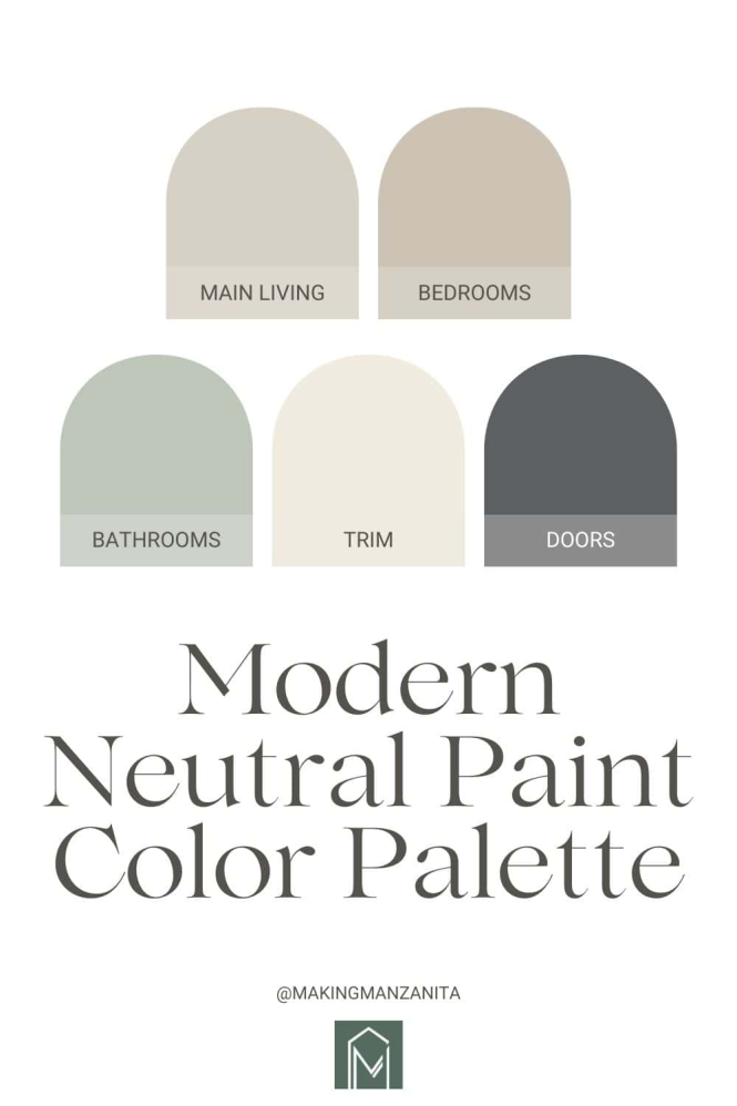
Several common neutral color schemes can be used in design projects. Monochromatic color schemes utilize different tones of a single color. Grayscale palettes are built around shades of gray, while accent colors can introduce pop of color into a neutral backdrop.
Exploring Neutral Color Combinations
To achieve the desired impact, it’s vital to experiment with various combinations of neutral colors. Different shades and tones of neutrals can create a wide spectrum of effects. Consider using complementary colors to introduce a vibrant contrast within a neutral design.
Creating a Harmonious Color Palette
Balancing Warmth and Coolness
When working with neutrals, understanding the warmth and coolness of different shades is essential. Warm neutrals, such as beiges and creams, create a cozy and inviting atmosphere. Cool neutrals, such as grays and whites, evoke a sense of calm and sophistication. Striking a balance between these two aspects can significantly influence the overall aesthetic. For example, a balance of warm and cool grays can produce a sophisticated and versatile palette suitable for both residential and corporate settings.
Introducing Accent Colors
While neutrals provide a foundation, introducing accent colors can add vibrancy and personality to a design. The selection of these accent colors should align with the overall style and mood. A simple, elegant accent color, such as a deep navy or emerald green, can transform a space from neutral to striking.
Considering Light and Shadow
The interaction between light and shadow on different neutral tones can significantly impact the perceived depth and dimension of a space or design. Using a variety of shades and tones within a neutral palette can bring depth to a design.
The Role of Texture in Neutral Palettes
Texture plays a vital role in bringing a neutral color palette to life. Varying textures in furniture, materials, and accessories can add visual interest and depth to a space. This is particularly important in rooms dominated by neutrals, preventing the design from feeling monotonous.
The Importance of Contrast
Using different values or intensities within a neutral palette adds depth and visual interest. Contrast between light and dark shades, or matte and shiny surfaces, can create a dynamic and engaging visual experience.
Applications of Neutral Color Palettes
Neutral Color Palettes in Interior Design
Neutral color palettes are frequently used in interior design to create a calming and inviting atmosphere. Their flexibility allows for various design styles, from minimalist to traditional, to be implemented effectively. Think of a modern living room furnished with neutral furniture against a backdrop of soft whites and grays, with pops of color provided by art or accessories. In addition to creating a cozy home environment, neutral colors create a sense of tranquility and harmony, promoting relaxation and calmness.
Neutral Color Palettes in Web Design
Neutral color palettes are also prevalent in web design. These palettes can convey professionalism, trustworthiness, and credibility, especially suitable for corporate or institutional websites. The use of neutral colors in navigation, backgrounds, and typography can enhance the user experience.
Neutral Color Palettes in Branding and Marketing
Neutral color palettes can project various brand identities. For instance, a brand prioritizing sophistication and modernity might choose a palette of sophisticated greys and blacks. Conversely, a brand focused on warmth and comfort might choose a palette of beige and cream.
Neutral Color Palettes in Product Design
Neutral color palettes are also valuable in product design. For instance, a tech company can use a sophisticated grayscale palette to represent their brand’s minimalism and innovation. This approach is often seen in electronics and other technology products.
Case Study: Minimalist Design
Numerous minimalist design examples showcase the effectiveness of neutral color palettes. These palettes allow the simplicity and elegance of the design to be highlighted, avoiding distractions.
Modern Design Trends and Neutral Palettes
The Rise of Minimalism
Minimalism is a prominent trend in modern design, where clean lines, uncluttered spaces, and a focus on functionality are paramount. Neutral colors perfectly complement this trend, emphasizing the simplicity and elegance of the design. The use of large spaces, natural light, and a simple color palette make minimalist spaces feel spacious and inviting. A successful example of a minimalist design using neutral tones is Apple’s product design, characterized by clean lines, simple shapes, and neutral color palettes.
The Importance of Comfort and Functionality
Beyond aesthetics, modern design prioritizes comfort and functionality. Neutral colors, particularly softer beiges and creams, can create a comfortable and welcoming ambiance. This is crucial in interior spaces where relaxation and well-being are prioritized.
The Impact of Sustainability
Sustainable design is gaining traction, and neutral colors often play a vital role. Natural materials often highlight the earthy tones of neutral color palettes, creating a harmonious environment.
Neutral Color Palettes and Accessibility
It’s worth considering the role of accessibility when selecting a neutral color palette. A well-considered contrast between the foreground and background can improve the readability of text and visuals for those with visual impairments.
Case Study: Neutral Colors in Contemporary Furniture
Several contemporary furniture brands emphasize neutral colors, acknowledging the importance of versatility and adaptability in modern design. This often involves combining several shades of neutral colors, creating depth and visual intrigue.
Further Considerations
Cultural Nuances
It’s important to note that the association and perception of neutral colors can differ across cultures. Understanding these cultural nuances can influence design choices.
Psychological Impacts
Neutral colors can evoke different psychological responses. For instance, cool neutrals might promote a sense of calmness, while warm neutrals may inspire feelings of coziness.
The Role of Lighting
Lighting plays a pivotal role in how neutral colors are perceived. Varying lighting conditions can alter the nuances of a neutral palette, influencing the overall mood and visual appeal of the space or product.
Adaptability of Neutral Colors
Neutral color palettes offer immense versatility, adapting well to different design styles and contexts. They provide a solid base upon which to build a design, creating adaptable spaces or products.
The Enduring Appeal of Neutrals
Neutrals remain a core element in modern design due to their adaptability and enduring appeal.
Frequently Asked Questions
What are the key advantages of using neutral color palettes in modern design?
Neutral color palettes offer a timeless appeal and versatile aesthetic that transcends trends. They are excellent choices for creating spaces or products that require a sense of sophistication, harmony, and calmness. In modern design, neutral colors are frequently used in various projects, from interior design to web design and branding. Using neutrals allows flexibility for introducing accent colors and patterns, preventing a sense of monotony and enabling a space to adapt to various needs and preferences.
How do I choose the right neutral colors for a specific design project?
The selection of neutral colors depends on the design context and desired outcome. Consider the intended mood, target audience, and overall style direction. Explore the subtle variations in shades of greys, beiges, or creams. Consider the interaction between light and shadow when choosing neutral color palettes. These aspects will significantly impact the perceived depth and dimension of the space or design. A balance between warm and cool neutrals is often ideal to achieve a visually interesting and harmonious aesthetic.
In conclusion, understanding neutral color palettes in modern design is crucial for creating visually appealing and harmonious spaces. By carefully considering the nuances of these colors and their applications, designers can achieve a sophisticated aesthetic and connect with their audience on a deeper level. This article provided a comprehensive guide to understanding neutral color palettes, from their theoretical foundations to practical applications in various design contexts. We encourage you to experiment with different neutral palettes and explore their endless possibilities to achieve your desired design outcomes. Explore the world of color further by visiting our website for more design inspiration and resources.