Modern color palettes, a dynamic blend of neutral and bold shades, are revolutionizing design across various fields. From web design to graphic arts and interior decor, these palettes offer an exciting new avenue for expressing creativity and evoking specific emotions. Modern designers are increasingly turning to sophisticated color harmonies to convey complex messages and create impactful visuals. However, navigating this exciting landscape can be daunting. Many designers struggle to find the perfect balance between neutral and bold colors, creating visually unappealing or dissonant results. This article provides a comprehensive guide to crafting effective modern color palettes, encompassing both neutral and bold hues. We will delve into the principles of color harmony, analyze successful case studies, and offer practical strategies for achieving optimal results. This guide will cover the essentials of creating color palettes, including the fundamental principles of color theory and tools for generating and modifying palettes. Furthermore, we will explore the psychological impact of different colors and consider cultural aspects that may influence color choices.
Understanding the Fundamentals of Color Theory
The Color Wheel and its Importance
Color theory forms the bedrock of effective color palette creation. The color wheel, a fundamental tool in design, visually represents the relationships between colors. Understanding the relationships helps determine which colors complement each other, create harmony, or induce a certain mood. This is where you start to understand color harmonies such as complementary, analogous, and triadic schemes. For instance, complementary colors, positioned opposite each other on the wheel, create a high-contrast effect, often used to highlight elements or draw attention. Analogous colors, located next to each other, create a harmonious and aesthetically pleasing palette. Triadic palettes leverage three colors evenly spaced around the wheel, creating a vibrant and balanced composition. This knowledge is crucial to making informed decisions regarding color choice and achieving visual harmony.
Creating Neutral and Bold Color Palettes
Exploring Neutral Palettes
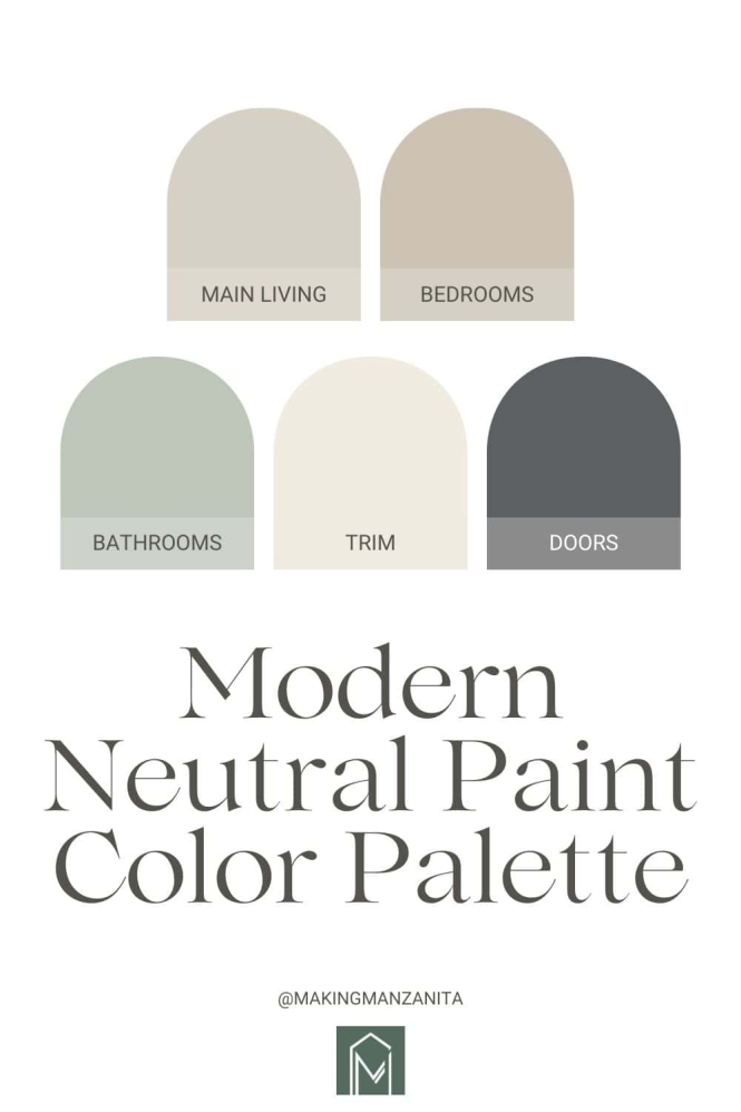
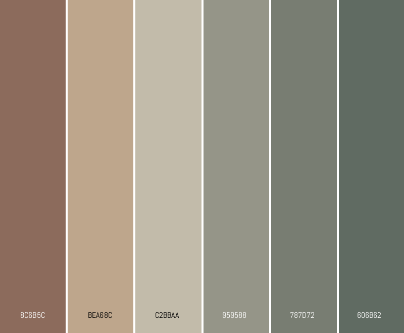
Neutral color palettes often offer a timeless and sophisticated aesthetic. They provide a clean canvas for bold accents and allow other design elements to take center stage. Neutral palettes can range from soft pastels to deep earth tones. For example, a palette comprising various shades of beige, cream, and gray creates a calm and serene atmosphere, perfect for minimalist designs. However, achieving visual interest within a neutral scheme demands strategic use of texture, patterns, and light. Incorporating elements of natural materials can significantly enhance the aesthetic appeal of neutral palettes. A sophisticated touch can be added through the careful selection of materials and textures.
Exploring Bold Color Combinations
Choosing Bold Colors Strategically
Bold color palettes, characterized by strong, vibrant hues, exude energy and dynamism. They can effectively draw attention to specific elements or evoke particular emotions. The key to a successful bold color palette lies in choosing the right combination. For example, a palette of crimson, emerald green, and gold can evoke a sense of luxury and opulence. However, it’s important to consider the overall context and message of your design. The impact of a bold color palette can be moderated using a complementary neutral color palette. Consider using a bold color for a call to action, or a focal point.
Applying Color Palettes Across Various Applications
Web Design
Utilizing modern color palettes is critical for effective web design. A well-chosen palette enhances user experience, increases engagement, and strengthens brand identity. For instance, a palette with a neutral base can create a clean and minimalist look, while a bold color palette can draw attention to promotional offers or important messages. Consider the color schemes employed by successful websites to get some inspiration.
Design Tools for Color Palette Creation
Leveraging Software Tools
Various software tools offer sophisticated features for creating and modifying color palettes. For example, Adobe Color, a popular choice among designers, provides a vast library of color palettes that can be adjusted to suit individual needs. These tools facilitate the creation and modification of color palettes, enabling the user to visualize different combinations in real-time. They also help in maintaining consistency and harmony across different design elements and applications.
How can I choose neutral colors in a modern palette?
Neutral colors provide a versatile backdrop for bolder elements in a design. Opt for a combination of greys, beiges, creams, and browns for a sophisticated look. Employ different shades and tints within a single palette to add visual depth and create a cohesive design. This can involve exploring different textures and patterns within the neutral scheme to maintain visual interest.
How can I make my design more interesting by using color?
Adding visual interest through color combinations is key in creating an engaging design. Carefully select colors that complement each other, creating a harmonious palette. This can involve a bold color palette and a complementary neutral palette. Experiment with different contrast levels, color harmonies, and the psychological impact that each color can have on the viewer.
How can I use modern color palettes in my everyday life?
Modern color palettes can be employed in a wide range of applications, from graphic design to interior decoration. Understand the principles of color theory and use design tools to create visually appealing and impact-driven designs. Consider the cultural context of your audience when choosing colors. Remember, good color choices can help establish a brand and evoke a desired emotional response from the viewer.
Conclusion
In conclusion, mastering modern color palettes, both neutral and bold, is crucial for crafting visually compelling and impactful designs. Understanding color theory, incorporating diverse combinations, and utilizing design tools will allow you to elevate your work and connect with your target audience on a deeper level. Explore the diverse options available, experiment with different combinations, and don’t hesitate to seek inspiration from various sources. This will solidify your understanding of color palettes and enable you to craft even more engaging and sophisticated designs. Continue your journey by exploring more advanced techniques and trends in color psychology. Visit our website to discover more color palettes and receive helpful tips and tricks for creating stunning designs using both neutral and bold colors. We hope this article was insightful, and look forward to your feedback on how you use these palettes in your work.
Frequently Asked Questions
What are the best ways to create modern color palettes?
Start by understanding the principles of color theory, including the color wheel and different color harmonies. Experiment with various combinations of colors, considering the emotional impact and cultural context. Utilizing design software and online resources can further enhance your palette selection process. You can also analyze successful color palettes used in existing designs for inspiration.
In conclusion, mastering modern color palettes, both neutral and bold, is crucial for creating visually appealing and impactful designs across various platforms. Understanding the principles of color harmony, considering cultural nuances, and leveraging design tools will allow you to elevate your work and connect with your target audience on a deeper level. Explore the diverse options available, experiment with different combinations, and don’t hesitate to seek inspiration from various sources. To continue your journey in color theory, consider exploring more advanced techniques and trends in color psychology. This will solidify your understanding of color palettes and enable you to craft even more engaging and sophisticated designs.