Creating a minimalist color palette is a powerful technique to elevate your designs, from logos to website layouts. It’s about stripping away the noise and presenting a clear, elegant visual language. This approach reduces visual clutter, focusing attention on the essential elements within your design. Often the most effective designs rely on the principles of minimalism, and selecting a thoughtful color palette plays a key role in achieving this aesthetic. This comprehensive guide will teach you the key principles behind creating a powerful minimalist color palette, from understanding the underlying psychology of colors to choosing the perfect colors to highlight your brand. We’ll explore various strategies to help you create a visually appealing and effective minimalist color palette for your projects. Let’s dive in!
Understanding Minimalist Design Principles
The Essence of Less is More
Minimalist design is not about emptiness, but rather about carefully selecting and arranging elements to create a powerful impact. It’s about simplicity, clarity, and a focus on the core message. A minimalist color palette is a crucial part of this approach. A well-chosen minimalist palette draws attention to essential elements and allows the design to breathe.
The Role of Color in Minimalism
Color plays a crucial role in minimalist designs, often acting as a powerful visual tool to communicate a brand’s identity. A minimalist color palette is characterized by its simplicity, clarity, and harmonious relationships between colors. By using fewer colors, the design avoids visual clutter, and the core message of your design stands out.
Avoiding Clutter and Achieving Focus
Visual clutter is a common pitfall in design, and a key aspect of minimalist aesthetics is reducing this. A limited color palette is key to this. By strategically choosing a handful of colors, you can create a cohesive and harmonious design that effortlessly guides the viewer’s eye to the most important elements. This is one of the key pillars of a successful minimalist color palette.
Research and Inspiration: Finding Your Perfect Palette
The Power of Research and Inspiration
Research is key to creating a successful minimalist color palette. Look at the work of successful minimalist designers. Study how they use color in their designs and look for recurring themes in their color choices. This will give you valuable insights and inspire new ideas for your own work. Often, the most successful designs have a cohesive narrative reflected in their chosen color palettes.
Identifying Your Design Goals
Before choosing any colors, think about your design goals. What message are you trying to convey? What feeling or emotion do you want to evoke in your audience? Understanding your design goals will shape the best approach to a cohesive color palette. Is it for a project related to luxury, or is it aimed at a younger demographic? Color choices reflect different ideas.
Finding the Right Color Combinations
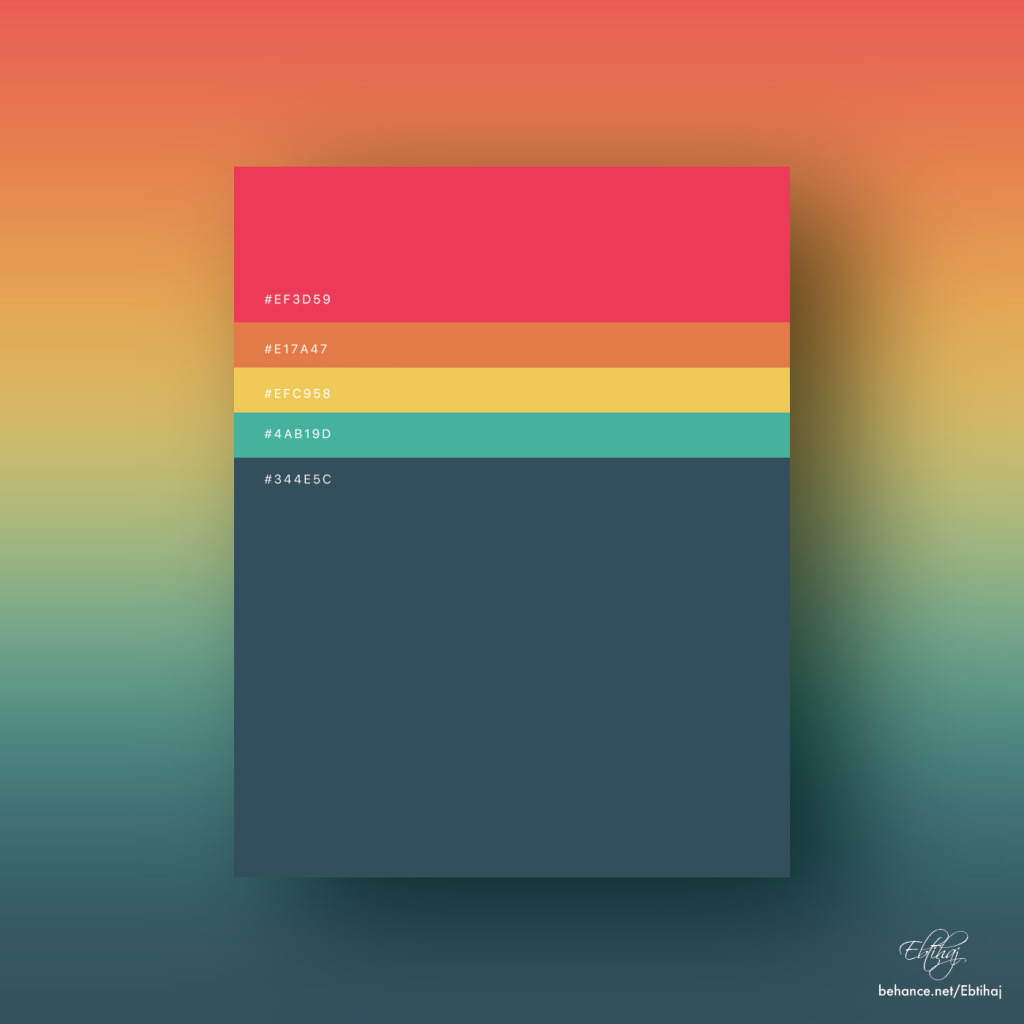
Experiment with different color combinations. Consider monochromatic palettes, analogous palettes, complementary palettes, triadic palettes, or split-complementary palettes. Understanding the different color schemes gives you a deeper understanding of how to choose colors, to create the desired effect in your design. Using the right palette is critical to creating a professional and polished final product.
Implementing Your Minimalist Palette
Choosing the Right Colors
Once you’ve chosen your colors, it’s essential to use them thoughtfully. Don’t just throw colors onto your design; think about how each color relates to the others and how they affect the overall look and feel. A professional and effective design is a testament to this principle.
Using Color for Emphasis
Minimalist palettes often use one or two colors to highlight key elements. Understanding the color hierarchy to focus the viewer’s eye can help emphasize the main design goals. The visual hierarchy is key to capturing attention and conveying the critical design details.
Maintaining Visual Harmony
Maintaining visual harmony is key to creating a successful minimalist color palette. Each color choice must work cohesively to create a unified aesthetic. Don’t be afraid to experiment; use trial and error, and maintain consistency within the design. A skilled designer understands the significance of visual harmony.
Advanced Techniques for Color Palette Design
Exploring Color Psychology
Understanding the psychology of color can significantly impact your choices. Different colors evoke different feelings and emotions. Understanding this psychology is essential to create the desired mood or message. Do your research on how various colors can affect a viewer’s feelings, which will help you build the best possible design.
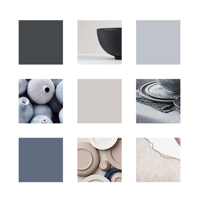
Creating a Monochromatic Palette
Using variations of a single color can create a sophisticated and visually appealing minimalist palette. A monochromatic palette offers great versatility and works beautifully in a variety of design contexts. It’s a popular choice for creating sleek and sophisticated designs, which can be highly effective.
Implementing Accent Colors
In some cases, incorporating accent colors can be highly effective in a minimalist palette. Accent colors can be used subtly to draw attention to specific elements, such as buttons or call-to-action areas. Choosing the right accent colors enhances the impact of the overall design.
Real-World Examples and Case Studies
Successful Minimalist Color Palettes in Practice
Examples of brands using minimalist color palettes successfully provide valuable case studies. By studying these cases, you can gain insights into the principles of minimalist color palette creation. Companies like Apple and Google showcase how to evoke emotion and create an unforgettable user experience through clever use of colors.
Case Study: Brand Logos and Their Color Palettes
The color choices of brand logos often reflect the brand’s identity. A study of these choices can highlight how different color palettes evoke distinct feelings and messages. Studying successful examples can inspire your own design decisions.
Analyzing Impact on Viewer Perception
The impact of minimalist color palettes on viewer perception is significant. These palettes help focus on the product or message rather than distracting elements, enhancing the user’s understanding of the brand and achieving the desired outcome. Understanding how people perceive color is valuable for design.
Color Schemes and Their Applications
The Role of Color Schemes
Understanding color schemes is essential for creating a well-rounded minimalist design. It’s about understanding how different colors relate to each other in terms of visual balance, contrast, and harmony. This allows a designer to focus on the key features of the design, without overwhelming the viewer’s eye.
Exploring Different Color Schemes
Several color schemes can achieve this, including monochromatic, analogous, and complementary schemes. These provide effective ways to create a cohesive and well-balanced minimalist palette. Using different schemes allows the designer to achieve the best results for each individual design.
Choosing a Suitable Color Scheme
Choosing a suitable color scheme is directly related to the project’s specific goals. For example, a vibrant and energetic brand might lean more towards a complementary color scheme, while a calm and sophisticated brand might prefer a monochromatic palette. Color choices are directly tied to achieving the final design goal.
Frequently Asked Questions
Q1: What is the best way to create a cohesive minimalist color palette?
A1: Creating a cohesive minimalist color palette involves several steps. First, identify your design goals and desired emotional response. Then, research and gather inspiration from existing minimalist designs. Experiment with different color schemes (monochromatic, analogous, etc.) and choose a palette that aligns with your brand. Finally, use the chosen colors consistently throughout your design to create a unified and impactful visual experience.
Q2: How do I choose the right colors for my minimalist design project?
A2: Choosing the right colors for your minimalist design involves understanding color psychology and theory. Research different color combinations, focusing on harmonious palettes such as monochromatic or analogous color schemes. Consider the feelings each color evokes and how they relate to your brand’s identity and target audience. Experiment with different options to determine what best conveys your design intent.
Q3: What are some common mistakes to avoid when creating a minimalist color palette?
A3: Common mistakes include using too many colors, not considering color psychology, and not using colors cohesively. Avoid overwhelming the viewer with too much color variety; instead, focus on a limited range of colors. Understand how different colors affect emotions and select those that align with your brand identity. Ensure consistent application of the palette across your design elements to create a strong and visually impactful design.
In conclusion, creating a minimalist color palette is a journey of simplification and discovery. It’s about stripping away the unnecessary and embracing the elegance of fewer, carefully chosen colors. By understanding your design goals, conducting thorough research, and practicing consistently, you can unlock your inner minimalist and produce stunning visuals. Ready to dive into the world of minimalist color palettes? Download our free guide today and start creating!