
Colors and textures in classic design form the bedrock of timeless aesthetics. Imagine a meticulously crafted piece of furniture, a beautifully draped gown, or a room overflowing with warmth and sophistication—these masterpieces often hinge on the thoughtful interplay of colors and textures. A deep dive into this topic reveals how combining these elements can breathe life and character into any space or object, creating a design that transcends fleeting trends. This article will explore the fundamental principles behind using colors and textures in classic design, from understanding their individual roles to learning how to combine them effectively. We’ll also examine real-world examples and explore potential pitfalls, ultimately equipping you with the knowledge and inspiration to create your own timeless designs.
Understanding the Foundation of Classic Design
The Role of Color in Establishing Mood
Color plays a fundamental role in evoking specific moods and feelings in design. A rich, deep red can instill warmth and passion, while calming blues can evoke a sense of tranquility. Choosing the right color palette can set the tone for a design project, influencing the overall experience. Classic design often relies on a harmonious blend of colors, avoiding overly saturated or jarring juxtapositions. Neutral palettes, incorporating various shades of beige, grey, and ivory, are frequently used as a backdrop, allowing bolder colors to stand out without overwhelming the viewer. Studies show that color psychology plays a vital part in user experience, therefore employing these principles is key to creating classic designs that feel inherently right.
Texture as a Catalyst for Sensory Experience
The Tactile Element and Depth
Texture adds a crucial element of depth and dimension to a design. It engages our sense of touch and elevates the overall aesthetic appeal. Think about the smooth finish of polished wood, the rough texture of hand-woven fabrics, or the subtle sheen of silk. These tactile variations add a layer of interest, making a design feel more engaging and less static. For classic designs, choosing textures that evoke a sense of timelessness and quality is essential. Natural materials like wood, stone, and linen are often used because of their inherent beauty and enduring appeal. It’s crucial to balance the textures in a design, avoiding overly busy or distracting combinations.
Combining Colors and Textures for a Timeless Look
Striking a Balance with Classic Color Schemes
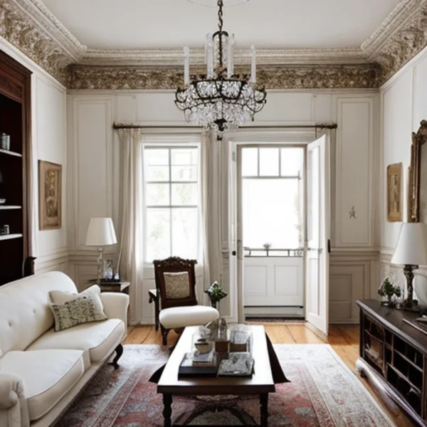
The key to creating classic designs lies in the artful combination of colors and textures. It’s not about choosing the flashiest colors or the most unusual textures; rather, it’s about using them in harmony to create a sense of elegance and sophistication. Classic color schemes often incorporate a neutral backdrop with pops of color in carefully chosen accents. For instance, an elegant living room might feature a neutral beige sofa paired with vibrant, but complementary, artwork and throw pillows. When introducing textures, think about how the materials relate to one another—is the smooth leather of a chair juxtaposed with the rough texture of a jute rug? This balance creates an inviting and visually appealing space.
Examples and Case Studies in Classic Design
Exploring Different Design Styles and Solutions
Numerous examples showcase how colors and textures contribute to a classic aesthetic. Consider the timeless design of a Louis XVI chair—the smooth, polished wood, the intricate carvings, and the luxurious upholstery all work together to create a sense of opulence. Similarly, a well-designed English country kitchen often features warm wood tones, woven baskets, and natural textiles, creating a cozy and inviting atmosphere. This is a clear demonstration of the ability of color and texture to enhance the appeal of everyday items.
Avoiding Common Pitfalls in Classic Design
Key Mistakes to Watch Out For
While embracing classic design principles can lead to timeless results, certain pitfalls should be avoided. For instance, mixing clashing colors or patterns can disrupt the harmony of the design. Also, using overly trendy textures can make a design seem dated. It’s essential to carefully consider each element and ensure its integration with the overall aesthetic. For example, using a modern, high-tech fabric in a traditional design setting could have a negative impact. Designers must be mindful of the context.
Building on Classic Design Principles
Exploring Different Styles and Variations
Building on classic design principles, a designer must explore different styles and variations to achieve desired results. Understanding classic design is about embracing timeless aesthetics and incorporating techniques that have stood the test of time, allowing your creations to be viewed as timeless, not simply fashionable.
Frequently Asked Questions
Q1: How can I create a cohesive color palette for my classic design project?
A1: When creating a cohesive color palette for a classic design, prioritize a neutral base with complementary colors used as accents. Consider using color palettes that reflect the overall mood and style you want to achieve. Classic design often utilizes subtle color gradations and harmonies to create depth and interest. For example, soft grays and creams can be layered with accents of richer jewel tones like emerald green or sapphire blue, creating an elegant and timeless look. Color theory provides valuable tools for creating a cohesive and harmonious palette.
Q2: What types of textures should I avoid in a classic design?
A2: Avoid overly trendy or modern textures when aiming for a classic design. Instead, focus on textures that evoke a sense of timelessness and quality. Look for natural materials like wood, stone, linen, and wool. Also avoid overly busy or contrasting textures. Excessive layering of textures can overwhelm the overall design, reducing its classic appeal. For example, mixing a highly polished chrome element with heavily distressed leather would disrupt the harmony of a classical room.
In conclusion, understanding the interplay of colors and textures is crucial for creating a truly classic design. By carefully considering the nuances of each element, designers can evoke a timeless quality in their work. Whether you’re designing a home, a piece of furniture, or a fashion garment, mastering the principles discussed here can elevate your aesthetic. Ready to elevate your design game? Explore our curated resources and start experimenting with colors and textures today!